We tend to believe that, as creative people, we should not follow trends but always create our unique styles and designs. That can be a good thing, but there are also exceptions. Be aware that the world is now connected in ways that weren’t possible a couple of decades ago.
Therefore, people will quickly connect to what you’re selling if you find ways of connecting it to a global trend that they recognise. That’s why we now have #Hashtags on social media — because people are now more connected to global trends. So while you may not copy the latest trends, there’s no harm in knowing what they are — you may even gain some inspiration.
In this article, we’ll focus on some colour trends that emerged in 2020, which we believe will only increase in the coming year. We will provide a few examples of businesses who have followed these trends and explain why we think they are likely to influence creative work across different industries all through 2021.
Hopefully, cosmetic manufacturers can find ways to incorporate these colour trends in their products and packaging.

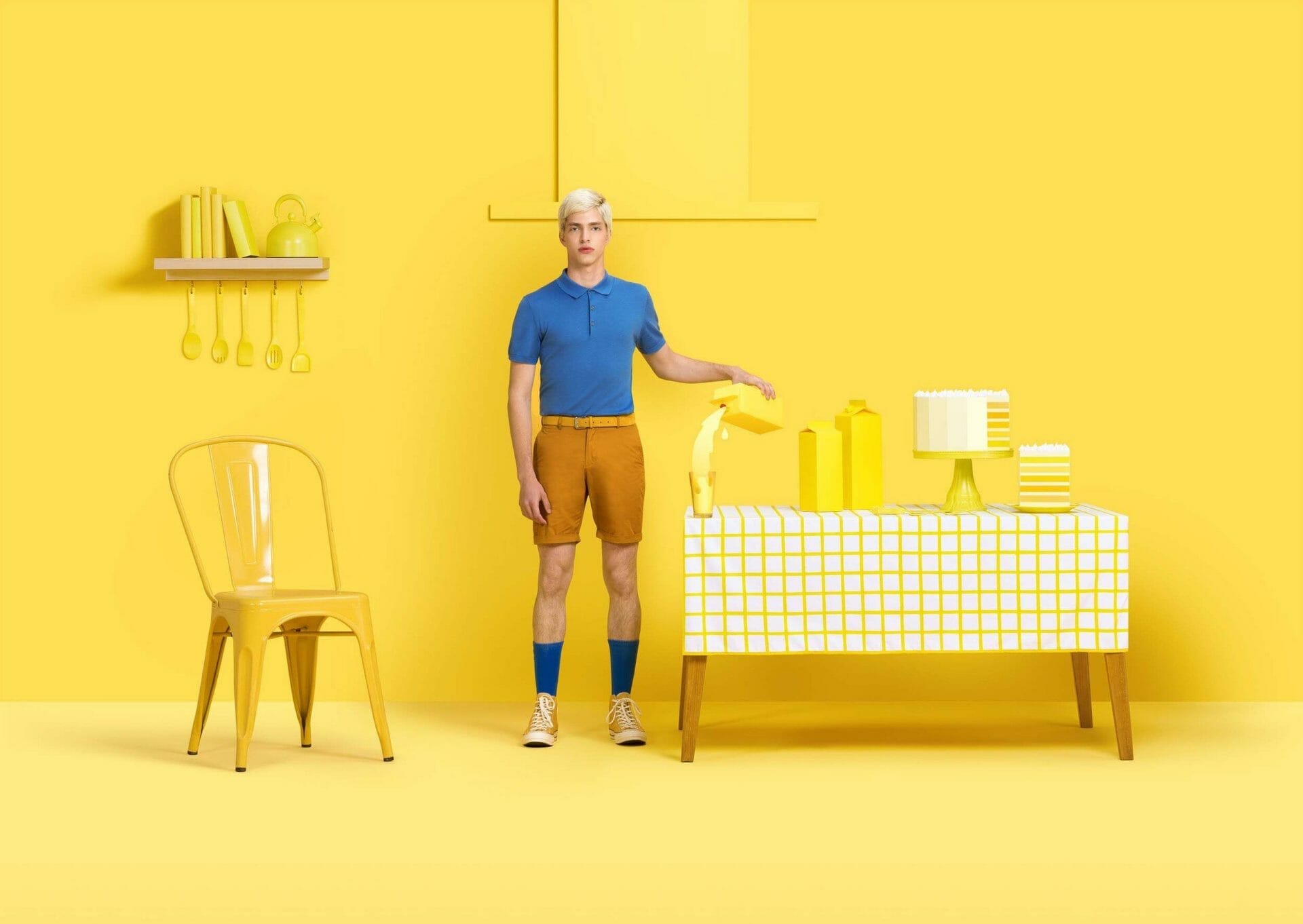
1. Muted Colours and Soft Pastels
In the design world, there has been an immense increase in the use of soft pastels and muted colours in 2020. That’s understandable since everyday life has plunged into turmoil and confusion worldwide by the pandemic and subsequent lockdowns.
For most people, it’s the biggest thing to ever happen in their life. To others, it’s the scariest thing. So it makes complete sense that the design world would react with calmer colour palettes that provide a feeling of protection and reassurance.
Take Mello for example, an application developed during the pandemic to help parents communicate and create support networks. Its colour palette, designed by Studio Skulptur, is suitably mellow, clearly conveying the impression that everything will be all right.

2. Nostalgic Faded Colours
Throughout 2020, the fading colours of nostalgia-fuelled designs have also been used in various designs, reminiscent of the heyday of print and low-fi production methods. This style has been central to many projects based on Covid-19, such as the brilliant wartime-parody posters of Annie Atkins, Virus Slogans.
In the branding of Conviction Records, a social organization aimed at crime reduction and rehabilitation, Everything Will Be Good even reveals fading, nostalgia-tinged colours. Truthfully, the pandemic may not be over so quickly. Therefore, we fully expect this colour pattern to increase in 2021.

3. Purposely Limited Palettes
Life in 2020, with our everyday lives stripped back to the bare necessities, has been nothing if constrained. So it makes sense that there have been plenty of minimal colour palettes in the world of design, which has somehow paid off for some businesses worldwide.
For example, the mint-green pattern was taken by Yummy Colours and ran with it for the fintech brand Afterpay, teaming up with Pantone to produce a custom colour named Afterparty Bondi Mint and drenching their current visual identity in the hue. Gretel’s celebrated rebrand of NI Instruments also mirrored this approach in other shades of green.

4. Radical Monochrome
You can’t get anything more of the old school than black and white when it comes to a nostalgic take on colour. But we’ve seen a lot of this colour scheme being used in 2020, and not to invoke the past, but to usher in a radical future. It seems like monochrome is now the perfect way to be edgy and disruptive.
There are also hints that this colour strategy is shifting from edge cases into the mainstream. An example is the bold and creative new packaging for Diageo’s new plastic-free bottle of Johnnie Walker whisky.
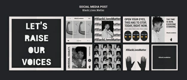
5. Colour as a Political Statement
Nowadays, almost everything is political, from the words you speak to the colours you flaunt. Yes, it is possible to make a statement with colours. For example, the death of George Floyd in May triggered millions around the world to post-black squares in solidarity with the Black Lives Matter movement on their social media feeds.
Moreover, the use of pink colours by celebrities in the run-up to the American elections to demonstrate their support for the Democrats, a visual homage to the January 2017 women’s march, was another instance of the trend.
In October, Pantone raised eyebrows by creating a new colour called Period in partnership with health brand, Intimina. The release, an original shade of red that is said to reflect a steady flow during menstruation, was intended to create a dialogue around periods and to encourage everyone in society to speak openly about the subject, irrespective of gender.
More of this is anticipated in 2021, with politics being increasingly unstable and chaotic worldwide and the inevitable economic downturn unlikely to aid matters. Creatives will do well to stay on top of the shifting political meaning of colours to avoid sending unintentional signals with their products.
In a Nutshell
If cosmetic manufacturers / private label cosmetics manufacturer can find ways to introduce specific colour trends in their products and packaging in a bid to soothe the already hurting world or show solidarity to a worthy cause, users will receive their products in the market.
At the same time, be careful when using some colours that may not go well in the hearts of users to avoid being seen as insensitive or unthoughtful.